01 / Commercial brand identity
Pink
Elephant.
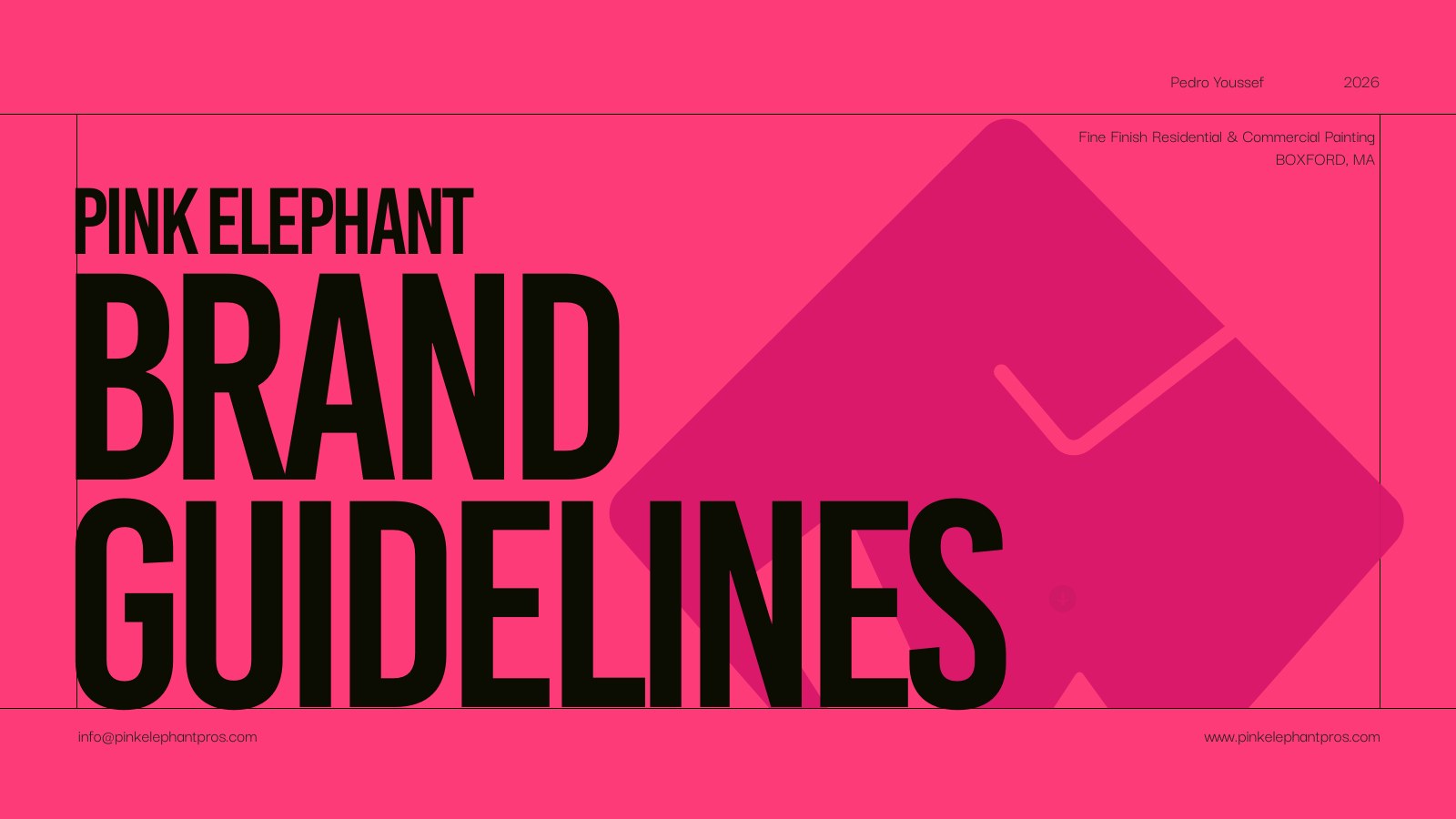
A distinctive identity system designed to make a Massachusetts painting company feel clear, credible, memorable, and ready to grow.
- Client
- Pink Elephant
- Industry
- Residential + commercial painting
- Role
- Strategy, art direction, identity, guidelines
- Deliverables
- Logo system, palette, typography, stationery, digital concepts
- Year
- 2026
01 / The brief
Professional craft.
Unmistakable presence.
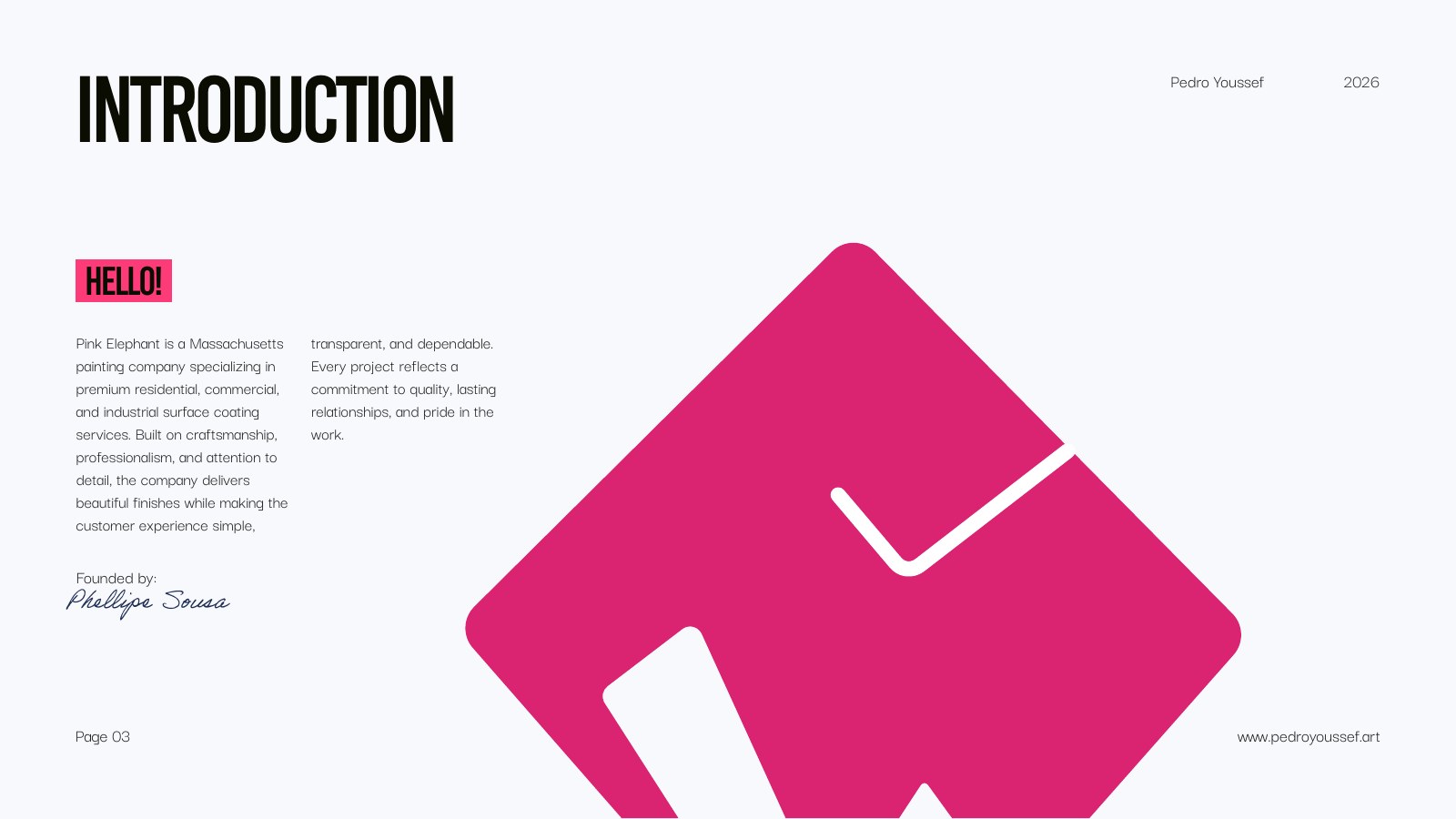
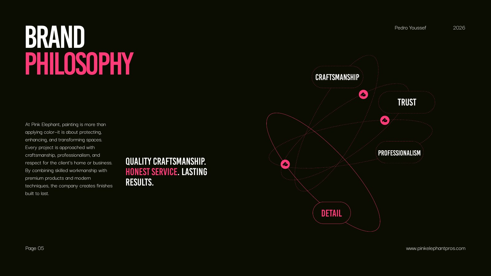
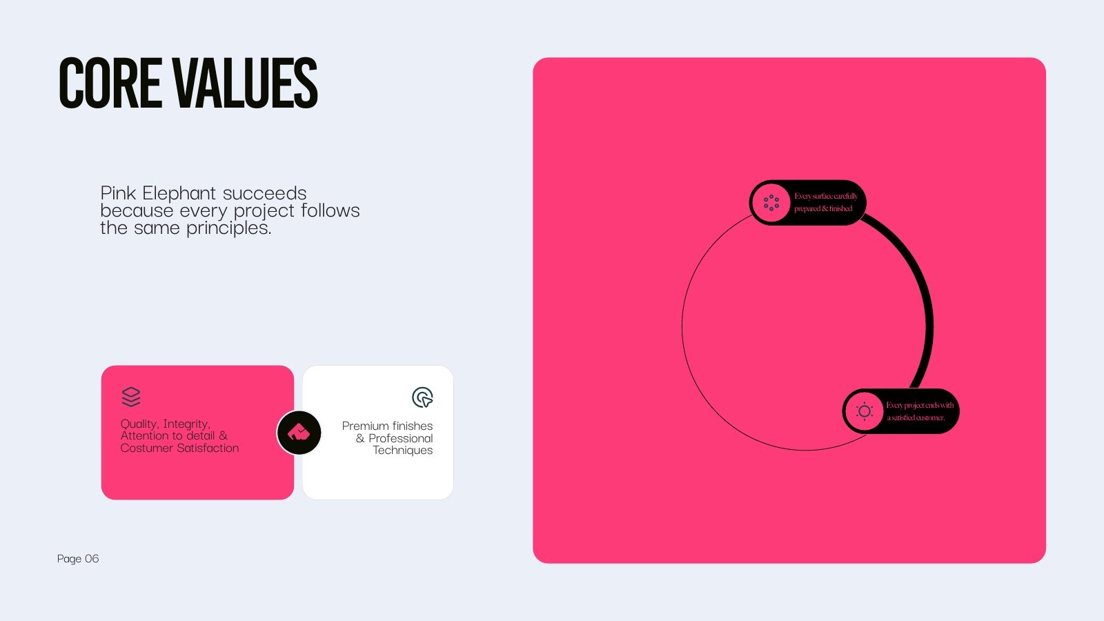
Pink Elephant needed a brand that could communicate detail, trust, and craftsmanship without blending into the category. The identity pairs a confident elephant mark with a direct visual language built for everything from a business card to a digital campaign.
The resulting system is energetic but controlled: bright pink creates recognition, black brings authority, and a flexible icon and wordmark family keeps the brand useful across practical applications.
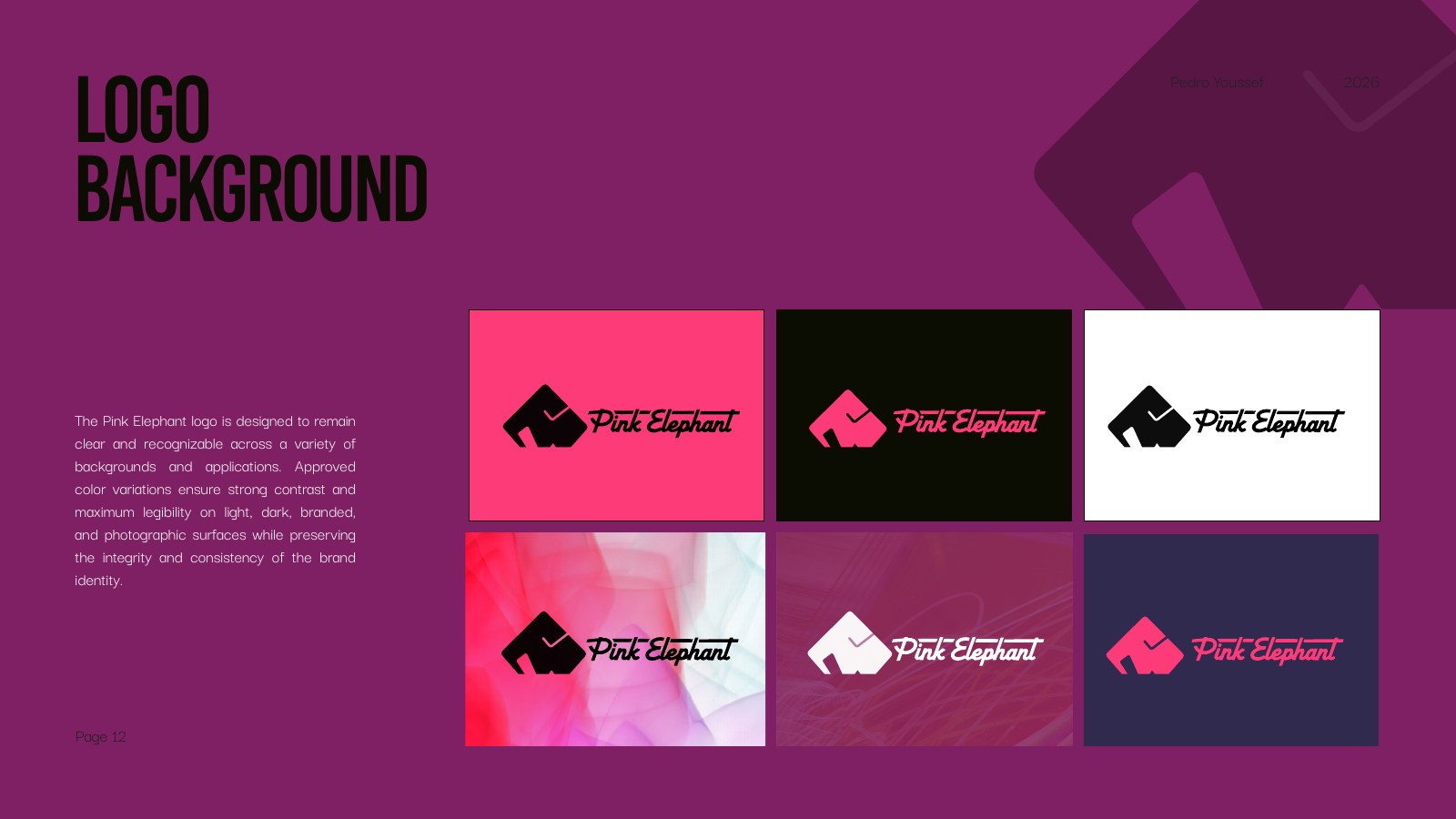
Logo
system.
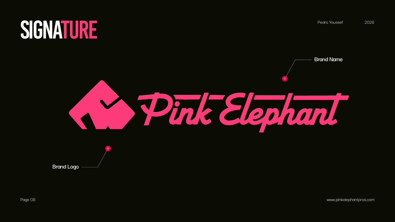
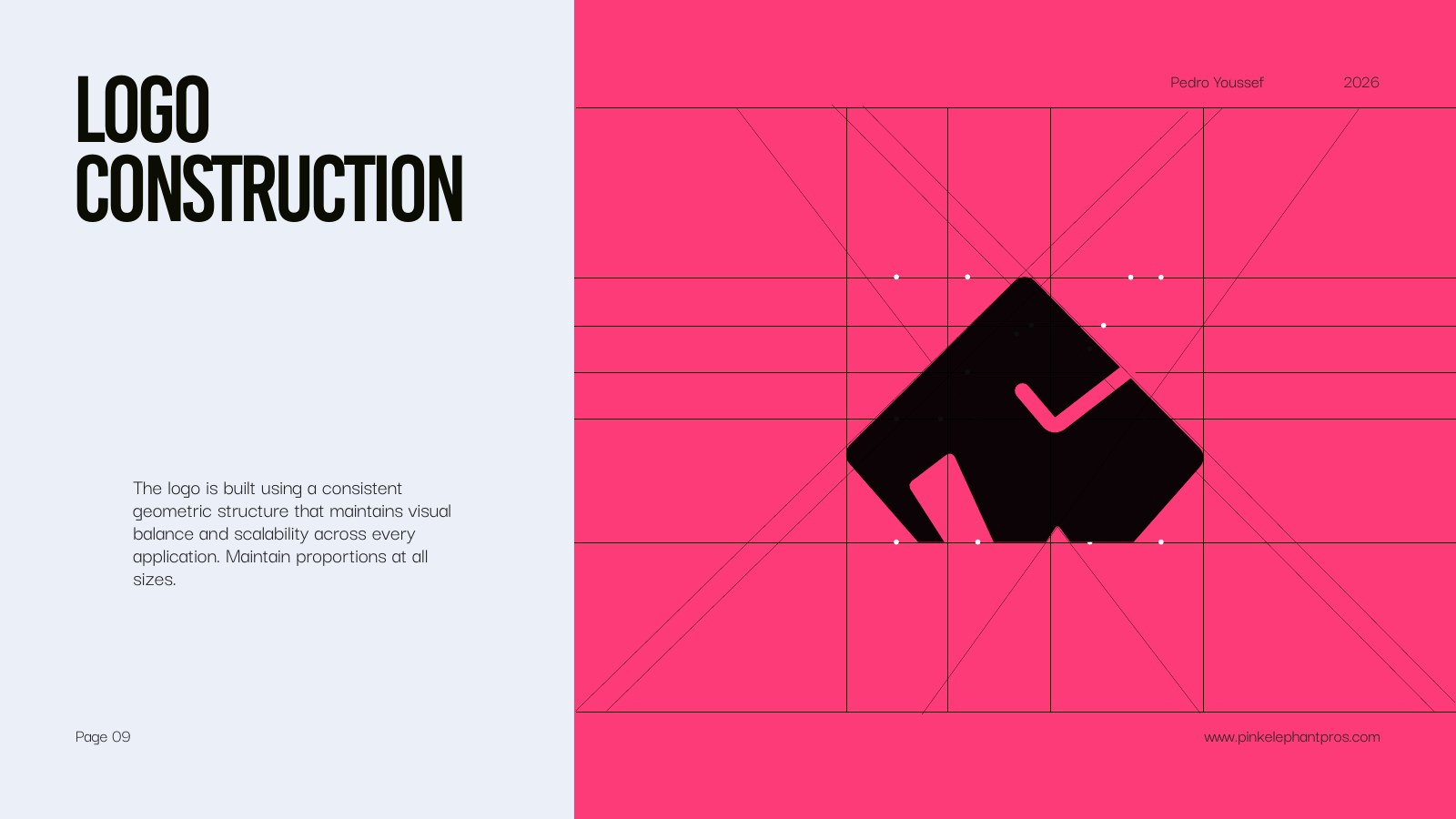
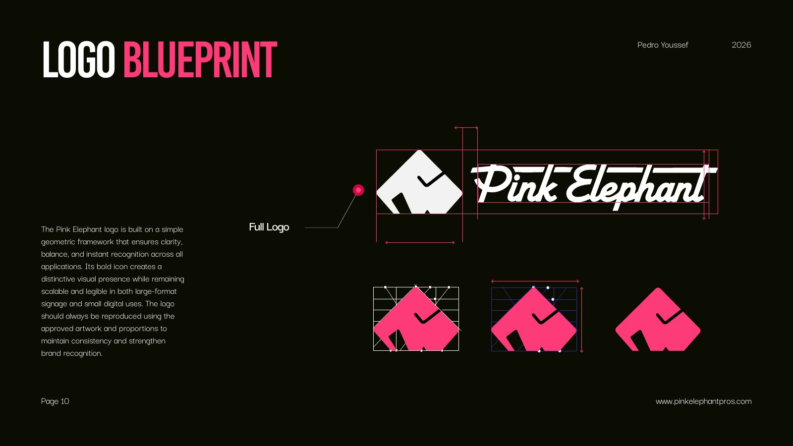
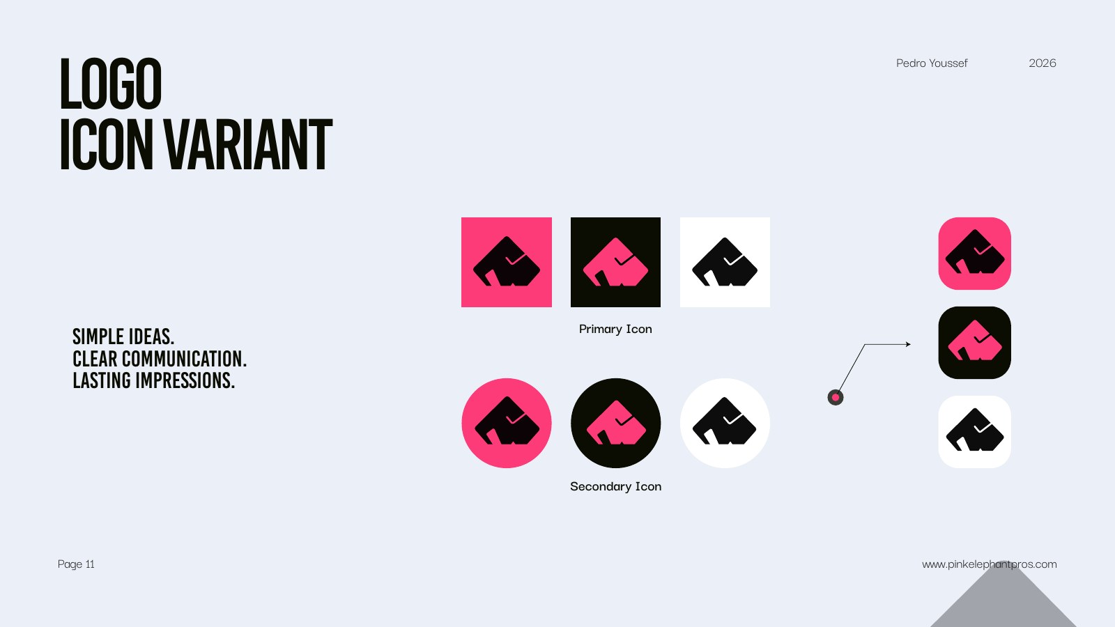
A recognizable elephant, simplified into a mark that stays clear from a storefront sign to a social icon.
03 / Color
Recognition at
first glance.
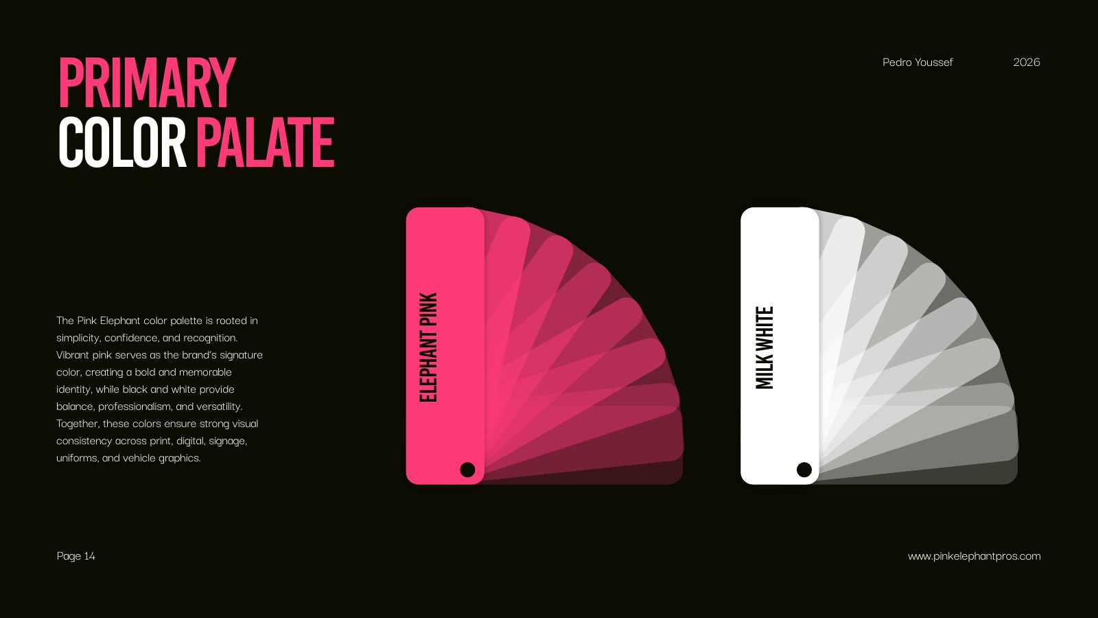
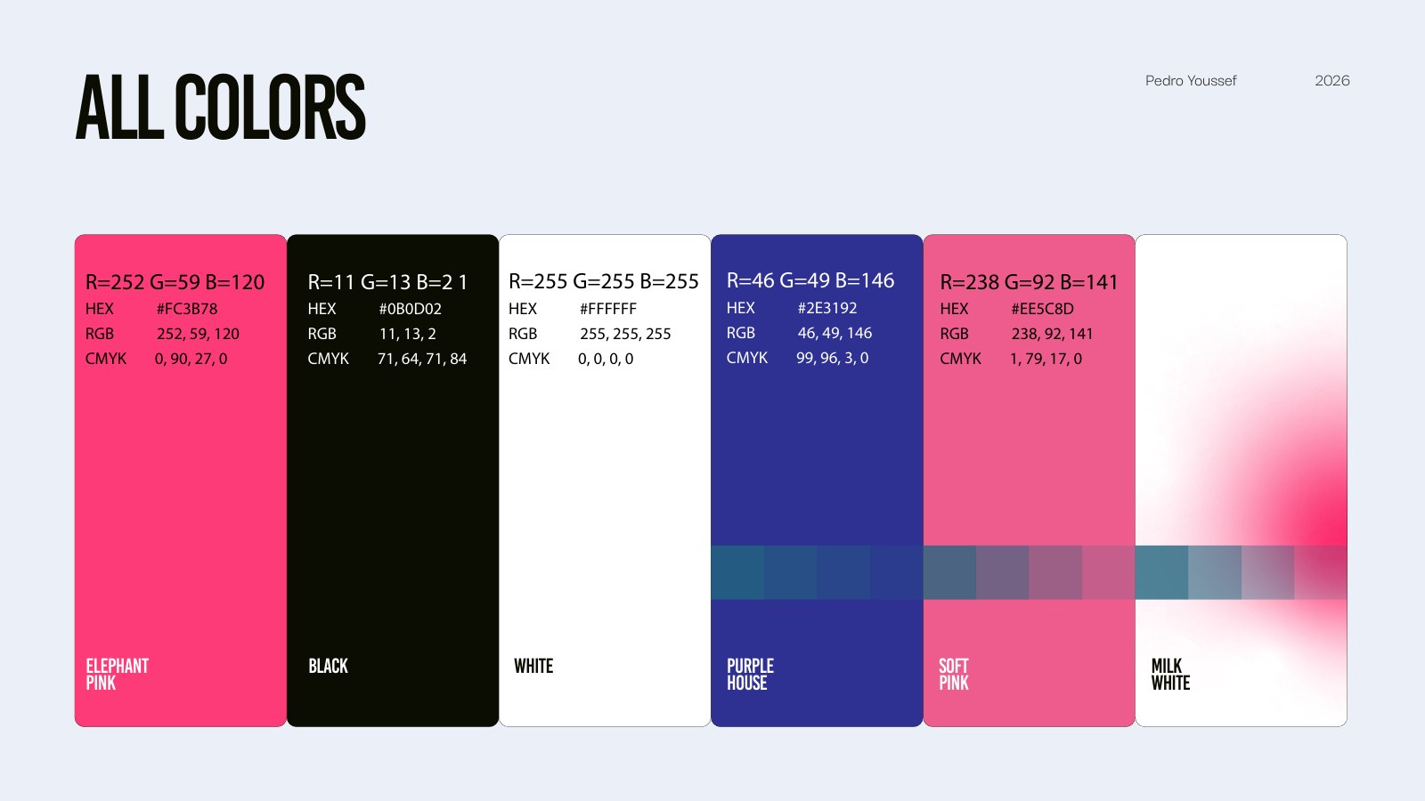
Elephant Pink is the identifying signal. Black, milk white, and a compact supporting palette give the system enough range for energetic campaigns, practical documents, and digital experiences.
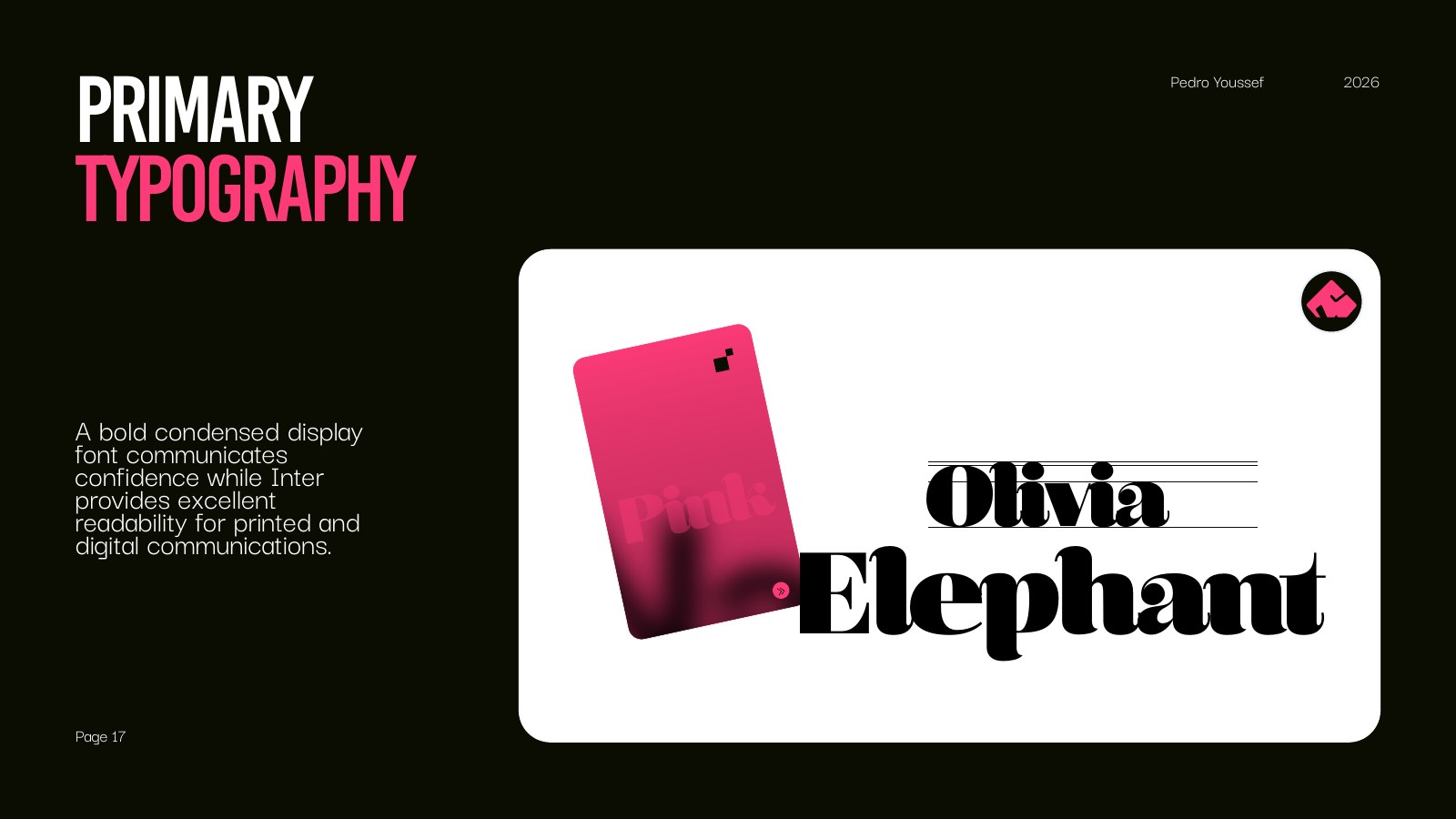
Type with
character.
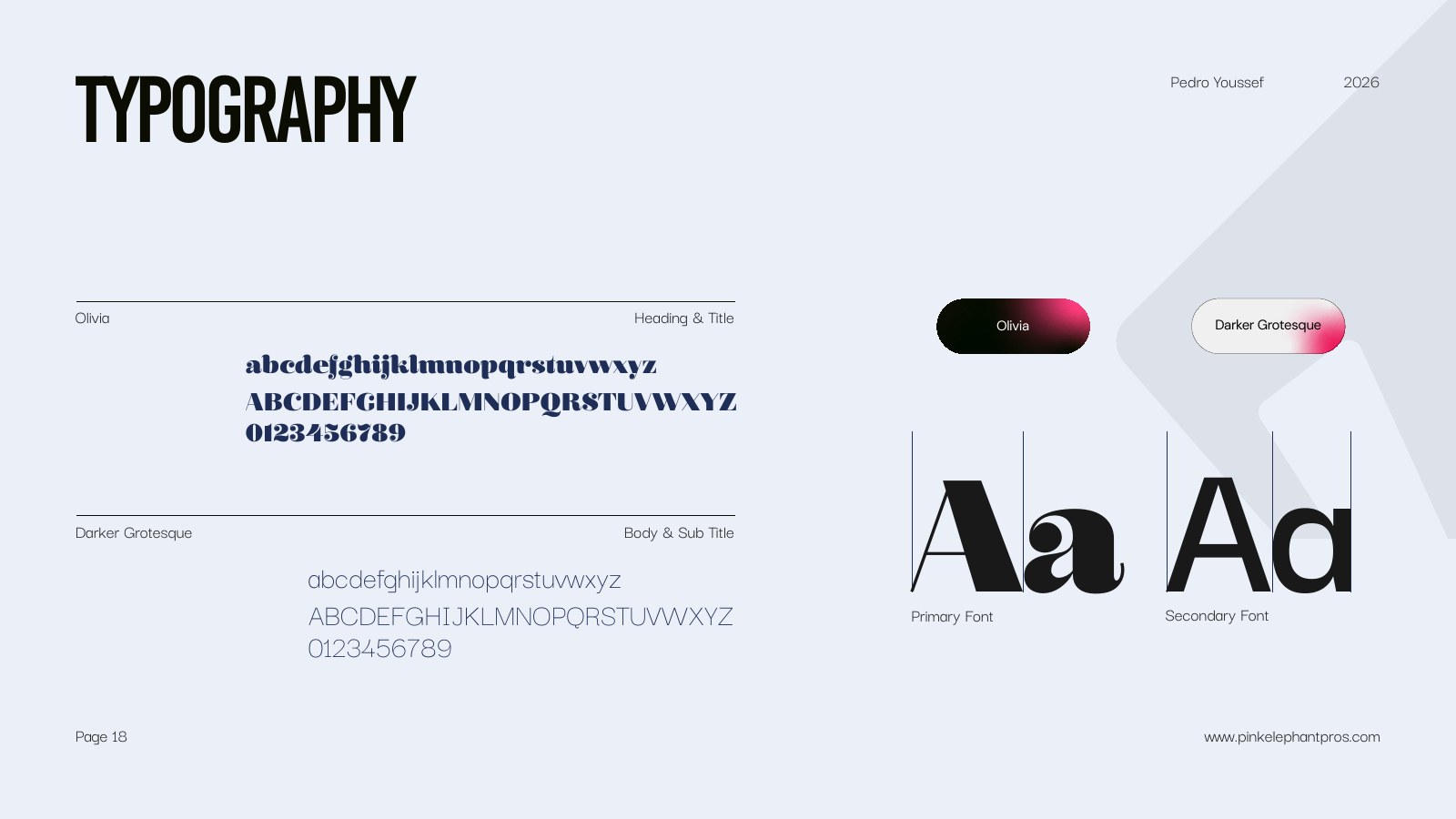
Bold condensed display type brings confidence; a quieter grotesque keeps supporting information structured and easy to use.
05 / Applications
Built for
the field.
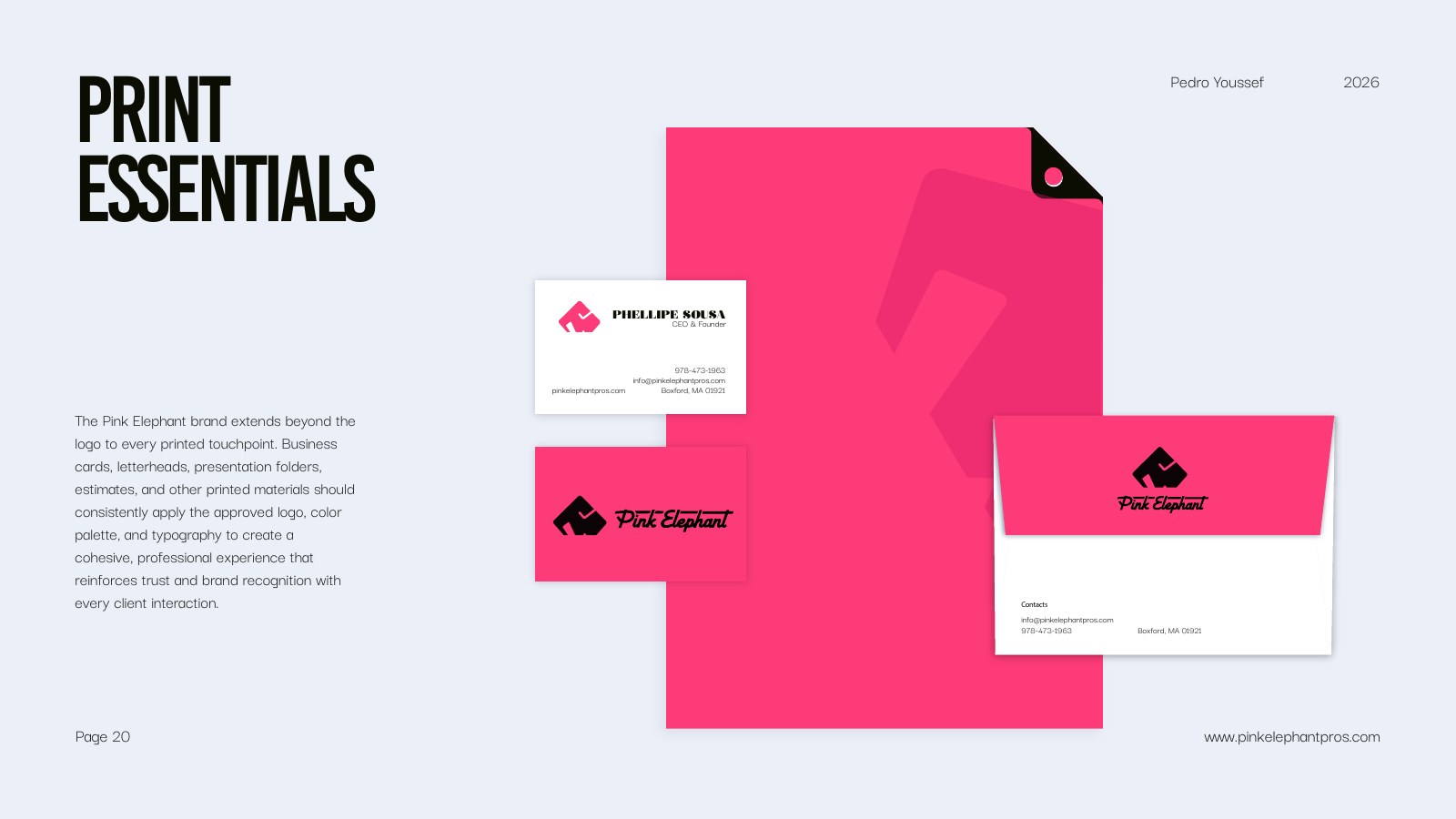
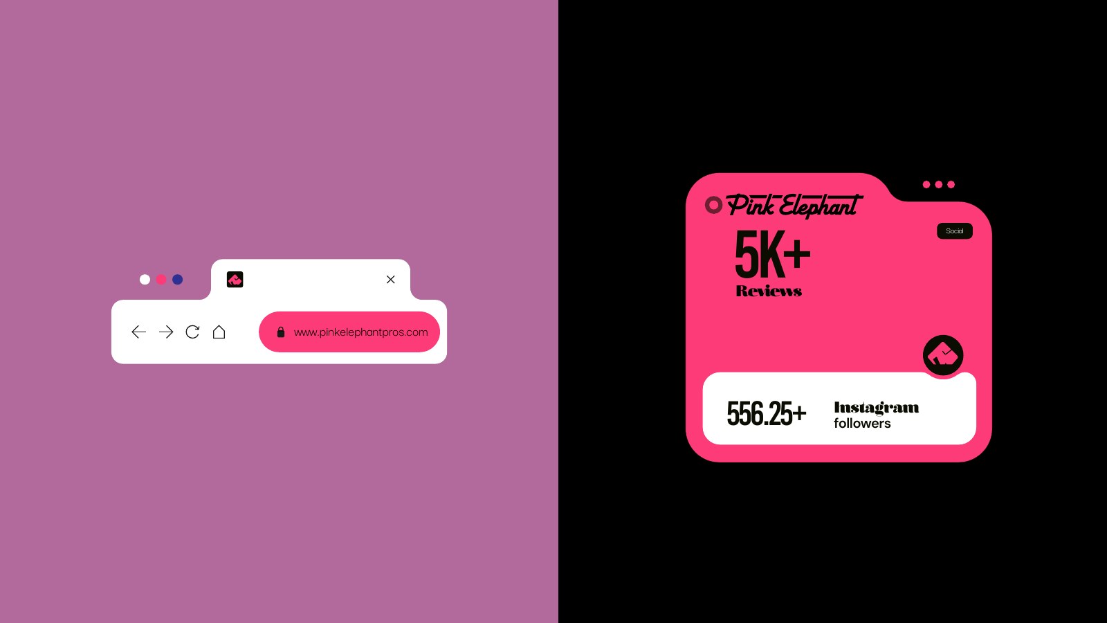
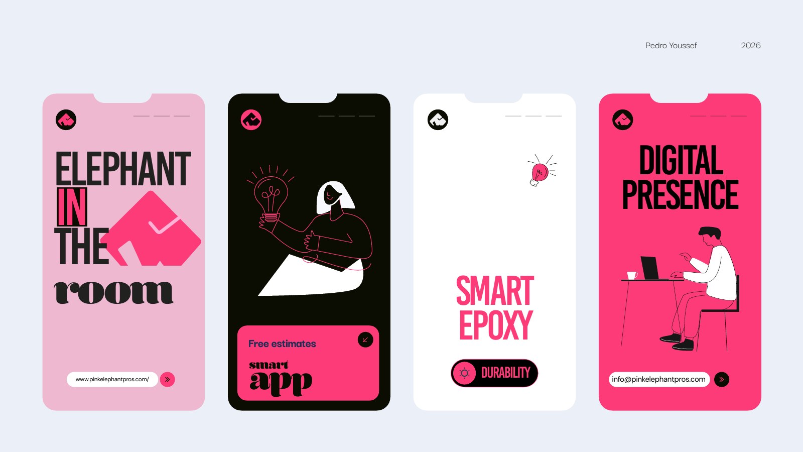
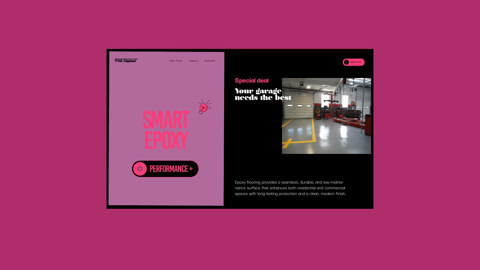
The identity extends across estimates, business cards, stationery, social stories, and digital concepts. Every touchpoint uses the same few rules so the company can stay recognizable while the content changes.